MEDIAFor Members of the Media
Press release
Please use it for interviews,
articles, and special features.
logo
- The design under the letters Deats represents “a vessel that accepts all”, which means accepting “everyone” and “the world” a part of our Vision and Mission
- Deats means “eat” (eat) “Dietary Fiber” (dietary fiber) and “Slim, Slender, Stylish“
- The base “blue” represents ”health”, “sacred”, and “Earth”
- Health : Blue, which was taboo in the food industry, was used as a revolutionary “new concept” as a color to express “health”
- Sacred : The motif is “blue cloth” that has been used as a sacred color since ancient times in Japan
- Earth : Meaning “everyone” and “the world” in our Vision and Mission
color
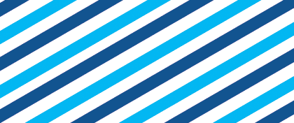
- The tricolor stripe used in many situations means “earth” in particular, and the stripe is the color that embodies Deats
- From the Earth: “Blue Skies”, “Blue Seas”, “White Clouds”
(Reference)Reference
【Dark blue】RGB:15,16,118
【Light blue】RGB:52,170,205
Usage GuidelinesNotes
Press material are meant only for members of the press.
- The use of the Logo, etc. may only be used in the media in connection with Deats Food Planning Co., Ltd. or its products and services. It can only be used as part of our introduction or articles about us.
- Personal use, commercial use, or use in content unrelated to us is prohibited.
- If you want to process or modify press materials (color correction, crop cutting, wording correction, etc.), please contact our marketing department (marketing@deats.co.jp) in advance.
- All materials provided on the download page below are copyrighted by Deats Food Planning Co., Ltd. and other one-year-old rights, and such rights are not transferred to the user of the material.
- Only those who understand the above should download the news materials from URl below.